11 Christmas Wedding Invitation Ideas That Set the Tone Before Guests Arrive
Invitations do more work than people usually give them credit for. They’re the first physical object a guest holds from your wedding, and they shape expectations about formality, color, and mood before anyone has booked a flight or picked out an outfit. For a Christmas wedding, the invitation is also an early chance to signal how much the season will factor in, whether that’s a subtle nod through color and texture or something that fully embraces the holiday.
These 11 Christmas wedding invitation ideas range from understated to festive, with notes on paper stock, printing methods, and wording that helps out-of-town guests plan around a busy travel season.
Deep Green and Gold Foil Details
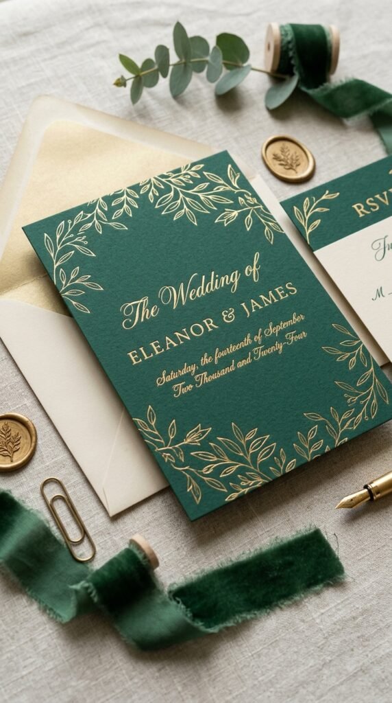
A deep emerald or forest green cardstock paired with gold foil lettering is one of the more reliably elegant ways to bring Christmas into an invitation without leaning on literal holiday imagery. The combination reads as rich and wintery rather than overtly seasonal.
Foil printing adds noticeably to the cost compared to flat or letterpress printing, so get quotes for both before committing, especially if you’re ordering a full suite of invitations, response cards, and envelopes. A thicker, matte cardstock tends to showcase foil more effectively than a thin or glossy stock, since the contrast between the matte surface and the shine of the foil is part of what makes it look premium.
A Watercolor Winter Botanical Illustration
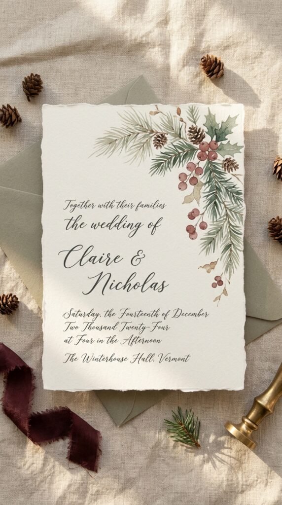
Soft, hand-painted illustrations of pine branches, holly, or winter berries along the border or corner of an invitation give a seasonal nod that feels more like fine art than a holiday card. Muted, slightly desaturated colors tend to look more sophisticated than bright, saturated holiday tones.
This style works well whether you hire an illustrator for a custom piece or choose from pre-designed templates that already include this kind of artwork, which is considerably more affordable. If budget allows for a custom illustration, ask whether the artist can also provide matching elements for a save-the-date, menu, or thank-you card, so the artwork carries consistently through your paper goods.
A Classic Red and White Christmas Card Aesthetic

For couples who want their invitation to read unmistakably as a Christmas wedding, a classic red and white palette, perhaps with a thin plaid border or a small embossed detail, leans into the season directly rather than hinting at it. This suits couples hosting a wedding that doubles as something of a holiday gathering for family.
Keep the red muted rather than bright primary red if you want it to feel elegant rather than like a standard holiday card, since a deeper brick or berry red tends to photograph and print more sophisticated than a true fire-engine red. Pairing it with a cream rather than stark white base also softens the overall look.
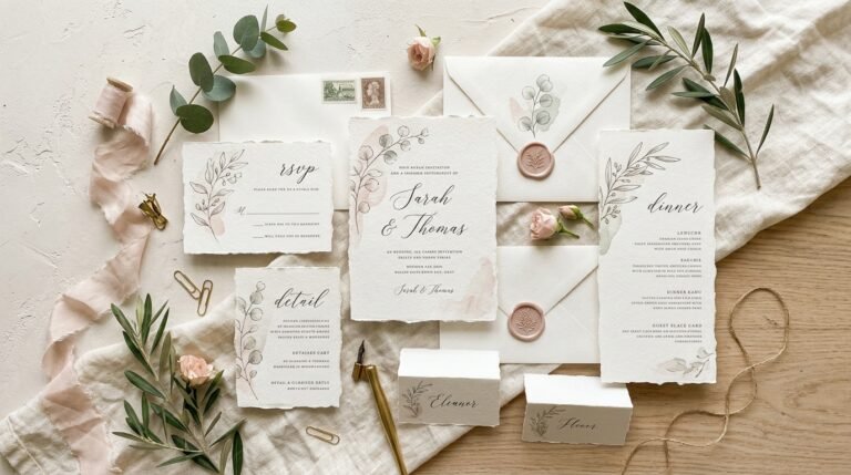
A Wax Seal with a Sprig of Greenery
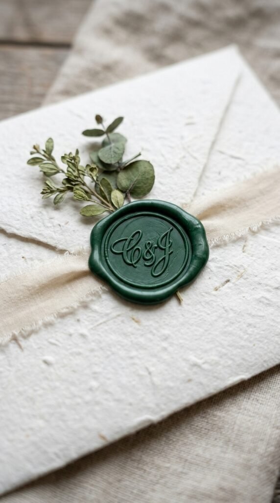
A wax seal in gold, deep green, or burgundy, stamped with a monogram or simple design, finishes an invitation with a tactile, old-world detail that photographs beautifully when styled with the rest of the suite. Tucking a small sprig of dried greenery or a single dried berry stem under the ribbon or seal adds a natural touch.
Wax seals can be fragile in transit, so ask your stationer about shipping options that protect them, like a vellum wrap or a rigid envelope, since a cracked seal on arrival undercuts the whole effect. If you’re assembling invitations yourself, practice the wax seal technique on a few test sheets first, since getting a clean, even seal takes some trial and error.
A Minimalist Design with a Single Festive Accent
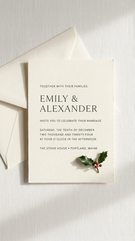
Rather than covering the invitation in seasonal imagery, a clean, modern design, simple typography on a cream or white background, with just one small seasonal detail like a sprig of holly in the corner or a thin gold border, lets the invitation feel current and understated rather than overtly themed.
This approach suits couples who want their wedding to feel elegant and timeless rather than tied too specifically to a holiday aesthetic that might feel dated in photos years later. It also tends to be one of the more affordable options, since minimal design work and fewer printed elements generally cost less than elaborate illustrations or foil work.
A Vintage Postcard-Style Invitation

Styled after old-fashioned holiday postcards, with a slightly aged paper texture, a simple illustrated winter scene, and typewriter-style or script fonts, this approach gives an invitation a nostalgic, old-world charm that suits a more traditional or vintage-inspired wedding.
This style pairs particularly well with a wedding that’s also incorporating other vintage details, like antique frames for signage or a classic cocktail hour. Ask your stationer about textured or slightly off-white cardstock, since a pure white, glossy finish undercuts the aged, nostalgic feel this style is going for.
Clear or Vellum Overlay with Printed Snowflakes
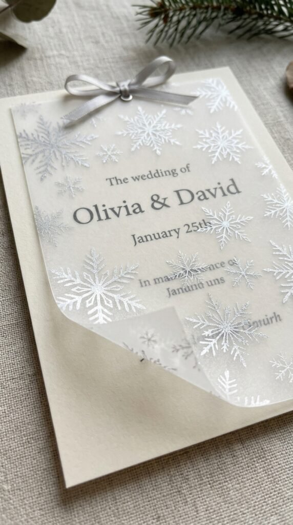
A sheer vellum overlay printed with a subtle snowflake pattern, layered over a solid invitation card, adds dimension and a wintery texture without relying on heavy color or imagery. It gives the invitation a delicate, almost frosted quality when held up to light.
Vellum can be more expensive to print on than standard cardstock, and it requires careful handling during assembly since it can wrinkle or tear more easily than regular paper. Confirm with your stationer whether they have experience working with vellum specifically, since not every printer handles it well.
Plaid or Tartan Pattern Borders
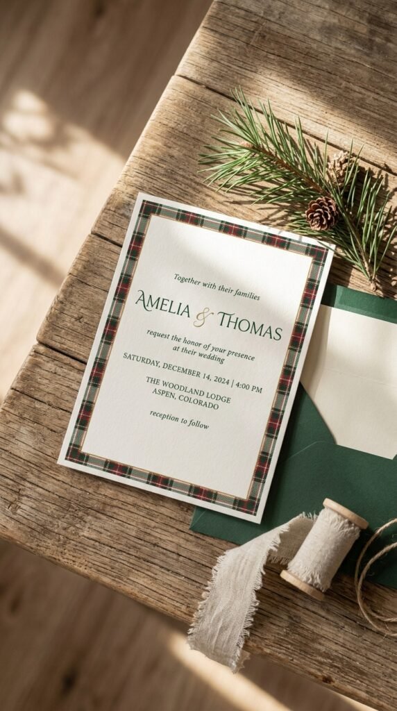
A thin plaid or tartan border along the edge of an invitation, in deep green, red, and cream, brings in a cozy, traditional winter texture that works whether the rest of the design is formal or more relaxed. Keeping the plaid to a border rather than a full background prevents it from overwhelming the text.
This detail works especially well if plaid or tartan is already part of your wider wedding decor, since it creates visual continuity between the invitation and the day itself. A single accent color pulled from the plaid, like the deep red or forest green, can also be used for the envelope lining for a cohesive finish.
An Evergreen Wreath or Branch Illustration Monogram

A couple’s monogram framed by a simple illustrated wreath or a sprig of evergreen branches gives the invitation a personal focal point while still nodding to the season. It works well centered on the front of the invitation or as a smaller detail on the response card and envelope seal.
This detail tends to work better as a line illustration than a fully rendered, colorful wreath, since a simpler illustration keeps the overall design from feeling busy, especially if other seasonal elements, like a plaid border or metallic foil, are already part of the suite. Many stationers offer monogram-and-wreath combinations as a template that can be adjusted to your colors.
Practical Wording That Accounts for Holiday Travel

Since a wedding around Christmas often competes with family holiday plans and travel schedules, invitation wording that clearly states the date well in advance, and politely acknowledges the timing, helps guests plan ahead. Some couples include a small note about nearby hotel blocks or travel tips directly within the invitation suite.
Sending save-the-dates earlier than you might for a non-holiday wedding, ideally eight to twelve months ahead, gives guests more runway to arrange time off work and holiday travel around your date. This is less a design decision than a planning one, but it affects attendance and guest experience as much as any visual detail on the card itself.
Metallic Ink on Kraft Paper

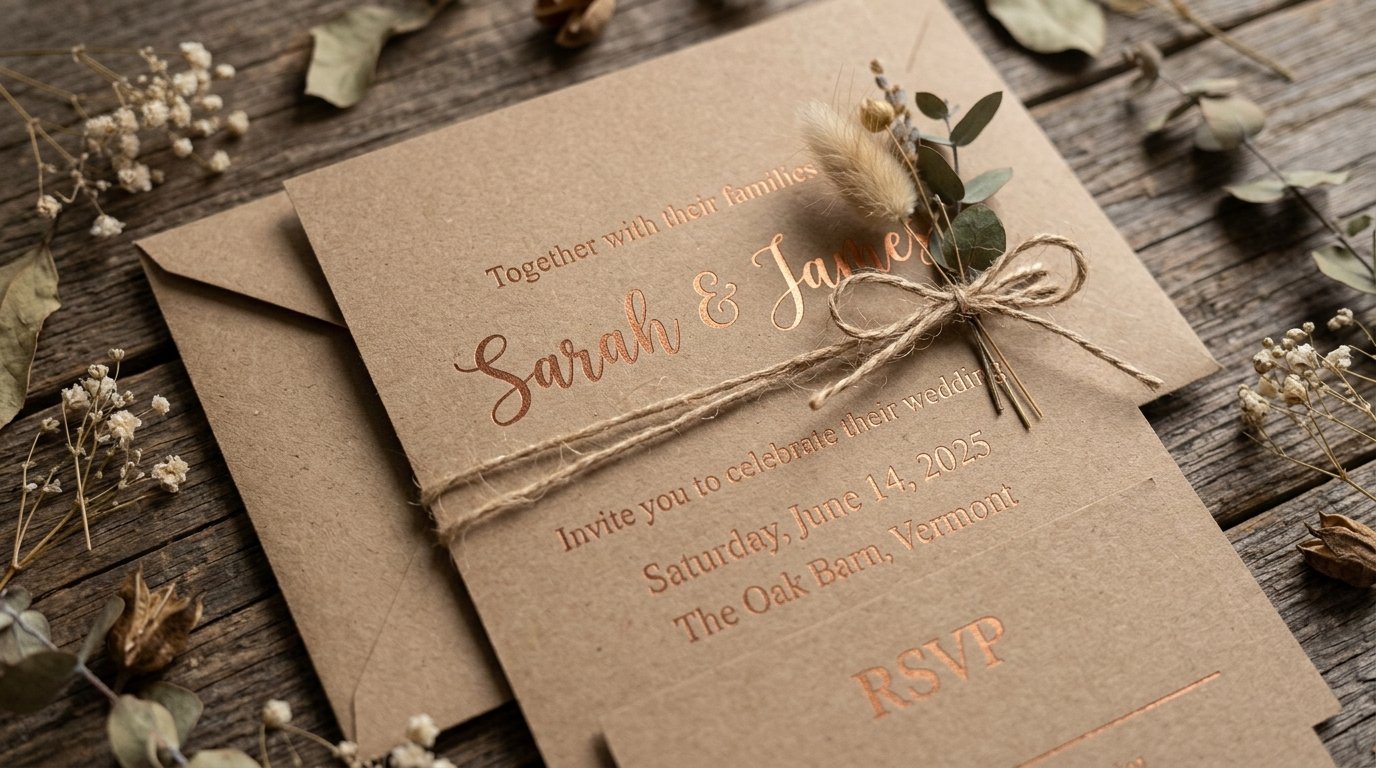
Pairing a rustic kraft paper base with metallic gold or copper ink creates a warm, textured contrast that feels both wintery and a little unexpected compared to the more common green-and-gold or red-and-white combinations. It suits rustic, barn, or cabin-style winter weddings particularly well.
Kraft paper has a natural, slightly rough texture that print shops handle differently than standard cardstock, so ask for a printed sample before committing to a full order, since ink can appear duller on kraft than it does on white or cream stock. This combination also tends to photograph well in flat-lay invitation suite photos, since the warm brown tone pairs nicely with dried florals or greenery styled alongside it.
Choosing the Right Christmas Invitation Style
Think about how literally you want the invitation to reference the season. A fully festive red-and-white or plaid design sets clear expectations for a cozy, holiday-adjacent celebration, while a minimalist design with a single seasonal accent keeps things elegant and works well if you want the wedding itself to feel timeless rather than tied to a specific holiday aesthetic.
Whatever direction you choose, send invitations and save-the-dates earlier than usual given the season’s travel demands, and consider how the design will carry through to your other paper goods, menus, programs, place cards, since a cohesive suite reads as more polished than invitations that stand alone, disconnected from the rest of your day-of details.