11 Burnt Orange and Navy Blue Wedding Decor Ideas That Feel Rich, Not Clashing
Burnt orange and navy blue is a pairing that shouldn’t work on paper and somehow works beautifully in person. The contrast is bold: navy brings depth and formality, burnt orange brings warmth and a little drama. Together they suit fall weddings especially well, though with the right balance of metallics and neutrals, the combination holds up year-round. The risk is letting either color dominate too heavily, which tips the look from rich and intentional into either too dark or too Halloween-adjacent.
These 11 burnt orange and navy blue wedding decor ideas focus on getting that balance right, with notes on ratios, seasonality, and where the pairing tends to go wrong.
A Color Ratio That Leads with Navy and Accents with Orange

Before choosing individual decorations, decide how the two colors will actually be distributed. Most successful versions of this palette use navy as the dominant tone, in linens, bridesmaid dresses, or large surfaces, and burnt orange as the accent, in florals, ribbon, or smaller details.
A rough starting point is 60 percent navy, 30 percent burnt orange, and 10 percent a neutral or metallic like gold, cream, or brass to keep the two from feeling like they’re fighting for attention. Reversing the ratio, with orange as the dominant color, tends to push the look toward a more autumn-harvest feel rather than the moodier, elegant tone most couples are after with this pairing.
Navy Linens with Burnt Orange Floral Centerpieces
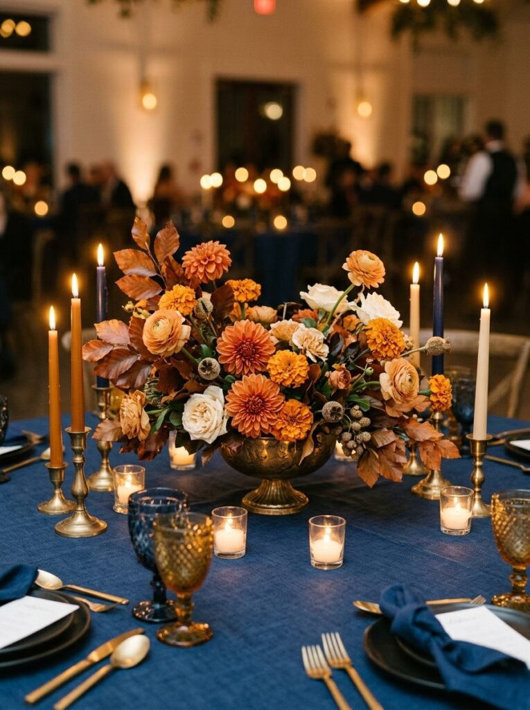
A deep navy tablecloth or runner sets a dramatic base, and centerpieces built around burnt orange dahlias, marigolds, or ranunculus, mixed with warm greenery like copper beech or eucalyptus, pop vividly against the dark fabric. Add a few cream or white blooms to keep the arrangement from reading as too saturated.
Navy linen can be harder to source in some rental inventories than more common colors, so confirm availability early, especially for a full room of tables. If budget is tight, navy runners over white or cream linens achieve a similar visual effect at a lower rental cost than full navy tablecloths throughout.
Gold Flatware and Charger Plates to Bridge the Two Colors
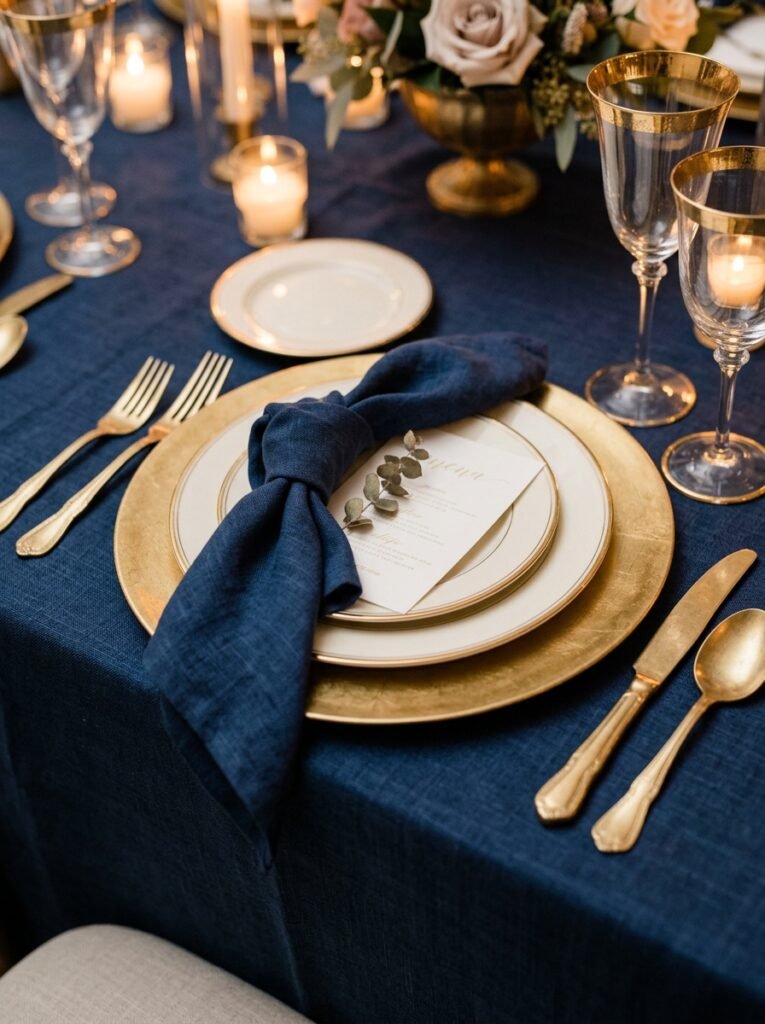
Gold acts as a natural bridge between navy and burnt orange, since both colors pair well with warm metallics. Gold chargers, flatware, and even gold-rimmed glassware tie the two main colors together without introducing a third competing hue.
Brass or antique gold tends to look slightly more sophisticated with this palette than a bright, polished gold, since it echoes the warmth of the orange without looking too shiny against the navy. If full gold flatware isn’t in the budget, gold-rimmed chargers alone can carry much of the visual effect for considerably less cost.
A Navy Ceremony Backdrop with Burnt Orange Floral Clusters
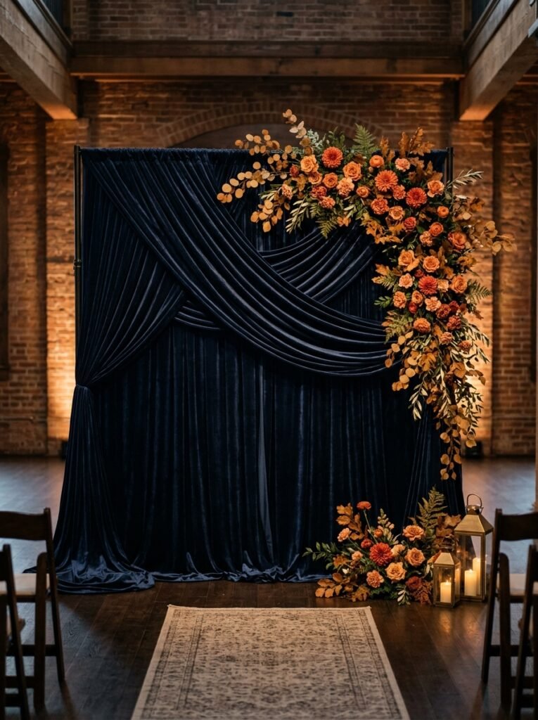
A draped navy fabric backdrop, whether velvet, chiffon, or a simpler cotton blend depending on budget, gives the ceremony a formal, moody base, with clusters of burnt orange blooms and greenery positioned asymmetrically rather than spread evenly across the fabric.
Velvet reads as the richest option but is also the heaviest and most expensive to rent or buy, so consider it for an indoor venue where it won’t need to withstand wind or heat. For outdoor ceremonies, a lighter navy fabric with a similar deep tone achieves the look without the practical issues velvet can create outside.
Burnt Orange Bridesmaid Dresses Against Navy Groomsmen Suits
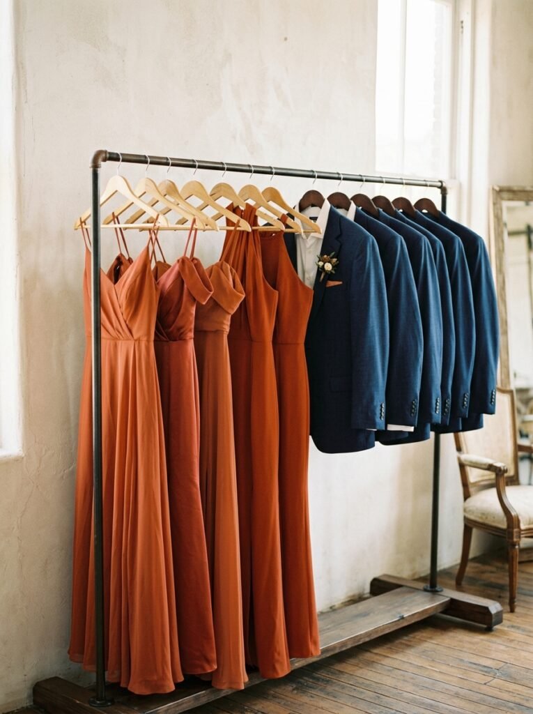
Putting the two colors directly on the wedding party, burnt orange dresses for bridesmaids and navy suits for groomsmen, creates one of the most striking visual moments of the day, especially in the wedding party photos. It also removes some decision fatigue from the decor side, since the color story is already established in the photos before guests even see the reception.
Burnt orange can read differently across fabric types and lighting, so order swatches before committing to a bulk order, since some fabrics lean more rust or more amber than true burnt orange. A mix of dress silhouettes within the same color, rather than identical dresses, tends to look more current and lets bridesmaids choose what suits them.
A Dessert Table with Navy Backdrops and Orange Accent Details
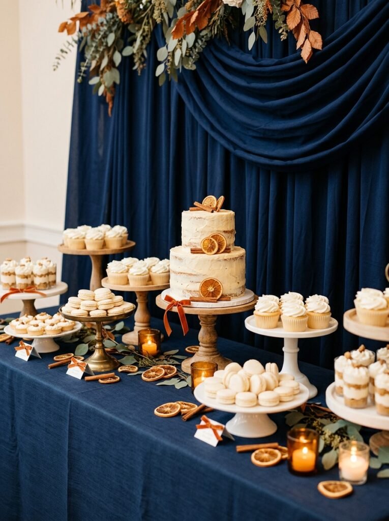
A dessert table styled with a navy or deep indigo backdrop, white or cream desserts as the main visual base, and small burnt orange accents, a ribbon here, a few sugared orange slices there, keeps the color story present without overwhelming what should be an appetizing display.
Avoid dyeing desserts themselves in saturated orange, since food coloring at that intensity can look artificial and slightly off-putting next to the rest of the decor. Natural accents, like dried orange slices, cinnamon sticks, or small marigold blooms, read as more elegant and tie back to the palette more convincingly than colored frosting.
Burnt Orange Velvet Ribbon on Bouquets and Chair Details

A wide burnt orange velvet ribbon, tied around bouquet stems or wrapped along the backs of ceremony chairs, adds a tactile, warm detail that photographs beautifully against navy suits or navy chair covers. Velvet ribbon in particular catches light in a way that satin or grosgrain doesn’t, giving it a slightly richer, more luxurious look.
This is one of the more affordable ways to bring both colors into a lot of small moments throughout the day, since ribbon is inexpensive relative to floral or linen costs. Buy a bit more than you think you need, since ribbon gets used in more places than couples typically plan for once setup begins.
A Navy and Copper Wedding Cake
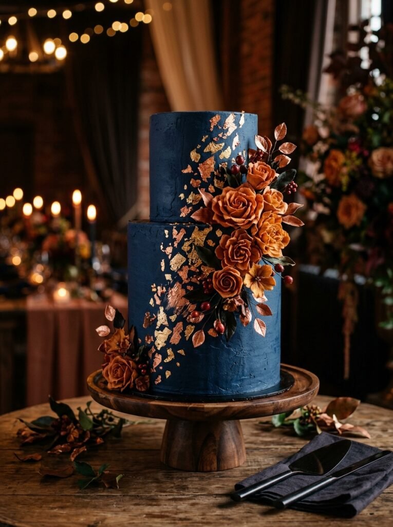
A cake finished in deep navy fondant or buttercream, with copper or gold leaf detailing and a few burnt orange sugar flowers or fresh blooms, turns the dessert centerpiece into one of the most photographed elements of the reception.
Navy, like black, can be a difficult color to achieve in buttercream without a bitter aftertaste from heavy dye use, so ask your baker about their process and taste a sample during your tasting rather than assuming it will be fine. Copper and gold metallic accents add noticeably to the price, so clarify what’s included before finalizing the design.
String Lighting with Warm Amber Tones
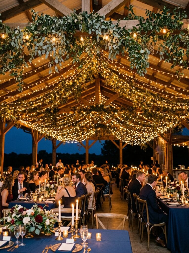
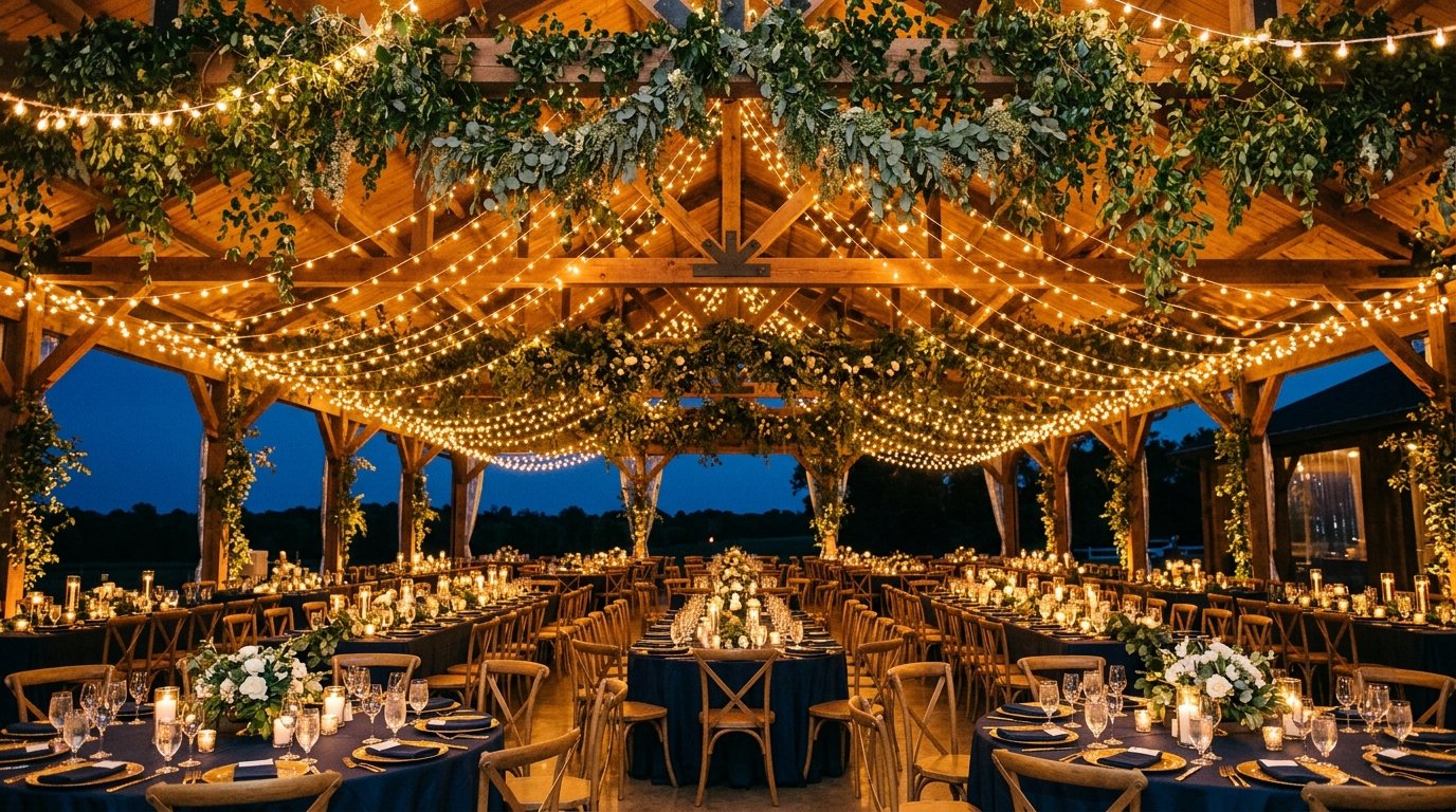
Warm amber or gold-toned string lighting, rather than bright white, suits this palette particularly well, since it echoes the burnt orange tones and keeps the overall room feeling warm despite the amount of navy in the decor. Draped over a reception space or wrapped through greenery, it prevents the room from feeling too cool or heavy.
Confirm the bulb color temperature with your lighting vendor ahead of time, since “warm white” varies between suppliers and some options lean closer to a cooler tone than expected. A warmer temperature, generally in the 2200 to 2700 Kelvin range, tends to photograph best against navy linens and dark wood venues.
Navy and Orange Stationery with a Bold Typographic Contrast

Invitations and paper goods that use navy as the background with burnt orange typography, or the reverse, cream cardstock with navy text and a burnt orange wax seal, give guests their first glimpse of the palette and set expectations for the day’s color story.
High contrast between the background and text matters for readability as much as style, so avoid placing burnt orange text directly on a navy background without testing it in print first, since some combinations that look fine on a screen lose legibility on paper. A simple gold foil detail, like a monogram or border, adds polish without competing with the two main colors.
A Navy Dance Floor Lighting Wash with Orange Uplighting Accents
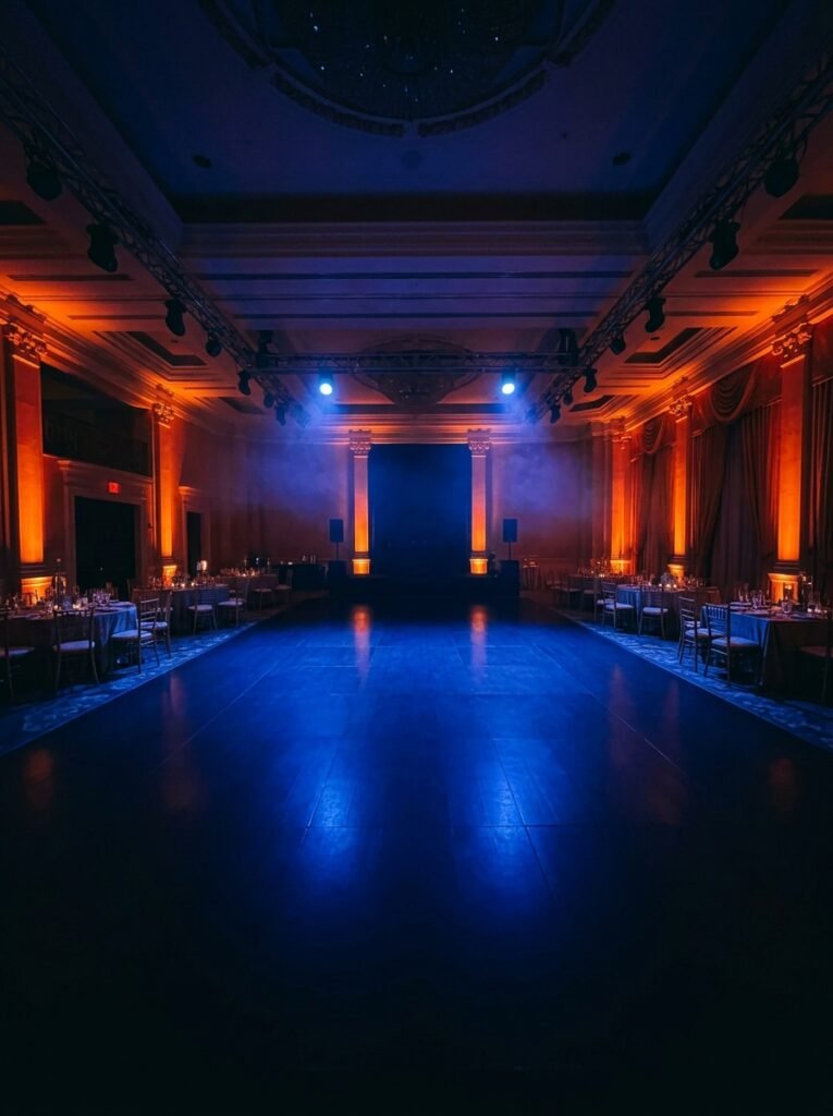
For the reception itself, lighting can carry the palette through the evening even after the tablescape is cleared for dancing. A navy or deep blue lighting wash across the dance floor, paired with burnt orange uplighting along the walls or behind the head table, keeps the color story present in a way that changes the room’s mood as the night goes on.
This works best in a venue with darker walls or minimal existing decor, since lighting washes show up less distinctly in a room with a lot of white or heavily patterned surfaces. Ask your DJ or lighting vendor whether they can program a transition, cooler navy tones earlier in the night shifting to warmer orange as dancing picks up, for a subtle but effective mood shift.
Bringing Burnt Orange and Navy Together
The pairing works best when one color clearly leads and the other supports it, rather than splitting the room evenly down the middle. Decide early whether navy or orange will dominate your specific wedding, then build your florals, linens, and lighting around that ratio rather than trying to balance the two perfectly in every single element.
Gold or brass metallics are doing more work in this palette than they might get credit for, since they’re what keeps the contrast from feeling stark. If you only invest in one unifying detail across the whole wedding, make it the metallic accents, since they show up in the flatware, the ribbon, the cake, and the stationery, and they’re what ties the boldest color pairing on this list into something that reads as cohesive rather than clashing.